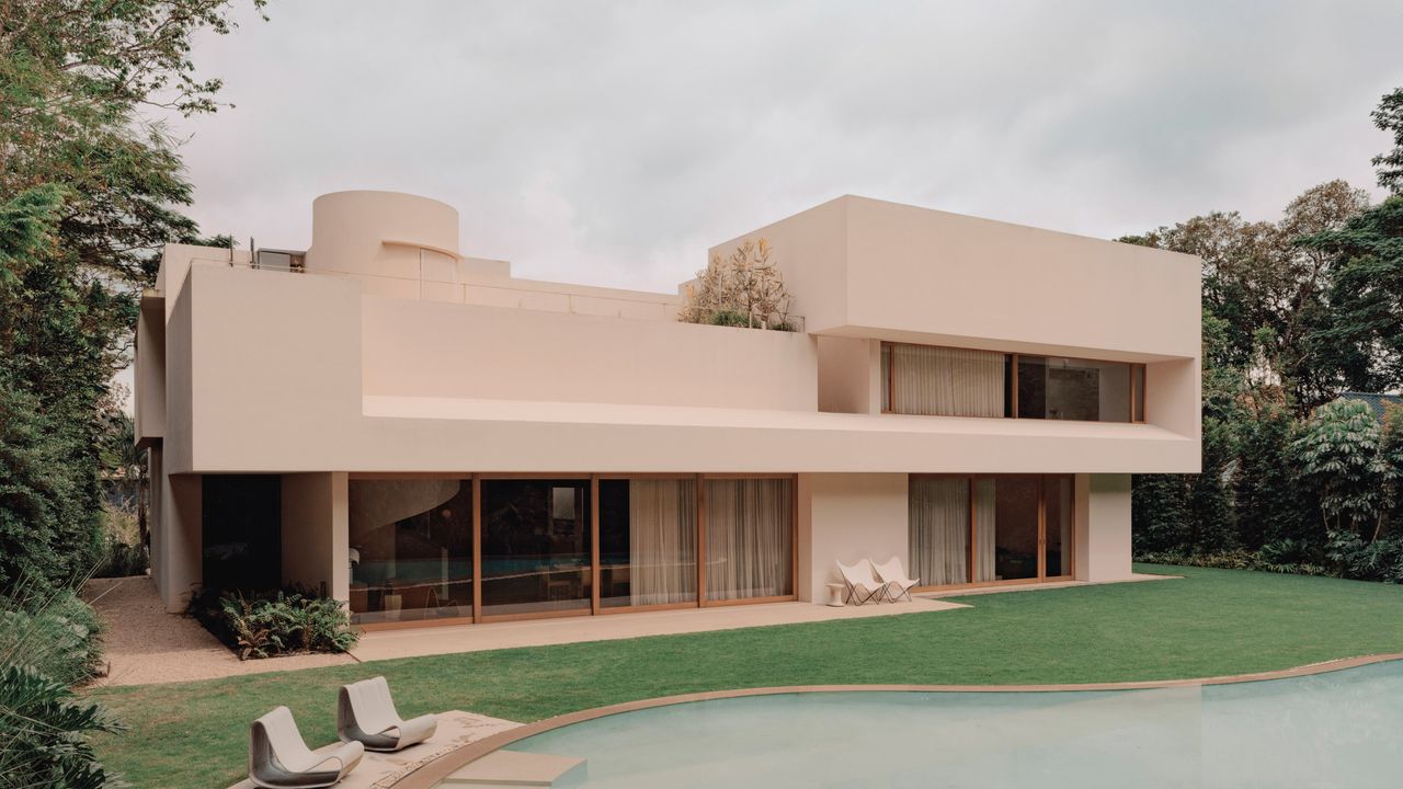
Architectural Digest has published a feature on a Le Corbusier-inspired villa set into the jungle outside Singapore — a candy-pink modernist house where, per the magazine, monkeys circle the pool and the interiors are furnished with Noguchi lamps and Max Lamb chairs. The story frames the home as an exercise in ultrarefined restraint wrapped in an unmistakably bold exterior color. According to Architectural Digest, the villa draws its formal language from Le Corbusier while pushing his palette toward something warmer and more theatrical. What reads at first as a decorative choice is, on closer inspection, a structural one — and that is the more interesting part of the story.
Color as a material decision, not a finish
Le Corbusier is often remembered for raw concrete, but color was central to his thinking. His Polychromie Architecturale — the architectural color system he first codified in 1931 and expanded in 1959 — treated pigment as a spatial tool that could advance or recede a wall, not as surface ornament. The Singapore villa sits squarely in that lineage: its pink is a compositional element that shapes how the volume reads against the green of the jungle, as the Architectural Digest feature makes clear through its indoor-outdoor framing.
The distinction the house draws out is between paint and pigment. A painted concrete surface is a two-material system — the wall and its coating — where the coating is the weak link: it weathers, chalks, and requires periodic recoating. Integral pigment, mixed into the concrete before it is cast, behaves as one material. The color does not sit on the wall; it is the wall. For a house in a humid, high-UV environment surrounded by jungle, that difference is the difference between a facade that ages gracefully and one that becomes a maintenance schedule.
Le Corbusier's Polychromie Architecturale (1931, expanded 1959): color codified as an architectural instrument — a way to shape volume and depth, not to decorate a completed surface.
What it signals for the LA market
Los Angeles has a long, confident relationship with color on residential architecture — from the saturated stucco of Spanish Revival to the pastel Deco of the mid-century Westside. But most of that color is applied: stucco tinted or painted over a combustible frame. The Singapore villa points at a different model that is quietly relevant here. As buyers move toward non-combustible construction in Fire Hazard Severity Zones, the question of how a concrete house looks becomes unavoidable — and the answer cannot be to spray a wood-house finish onto a masonry envelope.
A painted wall is a decision you remake every decade. A pigmented wall is a decision you make once.
Integral-color concrete resolves that tension. It lets a house read as warm, specific, and site-responsive — terracotta against chaparral, sand against a canyon wall — without importing the upkeep cycle of a coated facade. For a market increasingly willing to build in masonry for resilience reasons, color is the design vocabulary that makes that material feel like home rather than like infrastructure.
The pink villa in Singapore is a small, precise argument: that the boldest exterior gesture and the most durable one can be the same gesture. As California's luxury market reconciles resilient construction with genuine architectural warmth, that lesson — color chosen at the mix, not the brush — is one worth carrying west.